INSPIRED BY: “Let’s talk about event flyers and how they are perceived when designed by a professional instead of by an individual who created it using a PowerPoint slide. I’m thinking that at some point during your event promotional life, you should invest in a professionally designed flyer. Does flyer design matter?” – Jeffrey Clark, March 1, 2023
Today there is a difference in how promoters are marketing and promoting events, classes, and activities in the steppers market. Social media platforms, affordable digital tools, and apps like Canva and Photopea help everyone create marketing materials like flyers and promote content to thousands. The effort has become cheaper, more accessible, and more convenient. In the Chicago Stepping market, for the sake of your brand, your dollars, and your consumer, one should understand what it takes to launch effective marketing in the middle of a competitive attention economy.
Many steppers promote products, events, podcasts, and/or services. How does anyone stand out? How do you “look”? What is the impression you want to make? Are you selling Chicago Stepping for what it is? I see many classic flyers for events and classes. Still, sometimes I see flyers for stepping classes with graphics representing other dance styles, misspellings, incomplete flyers for even a save-the-date, mismatched days and dates, and crowded content that is hard to read.
One of our stepping community’s most sought-after creative designers, whose flyer designs continuously grace my social media feed throughout the year, has a point of view to share. When at a weekend event and a six-flyer spread on the table was created by the same person, but they are unique, and each tells a different story, that is a gift and talent to discuss. Sharvin Whitted of North Carolina – said creative designer – has designed flyers and materials for several Steppers weekend events. He knows what it takes to stand out and execute the vision for a stepping experience. He shares his perspective on Chicago Stepping when it comes to marketing our dance and events.
About the Designer and Stepper Sharvin Whitted

Sharvin Whitted has been stepping since roughly 2008, and I am completing 15 years in the stepping game. In Raleigh, NC, Roslyn Brown and her Mom, who founded Capital City Steppers kept inviting me out to try Chicago Stepping. I stopped at their classes every Tuesday. Someone was doing a trio with two ladies at TJ’s.
“I thought that was pretty cool, and I wanted to learn that.This guy was smooth, and dancing with two ladies at one time put me over the edge.”
Sharvin
As the President of Capital City Steppers, he has built all these great relationships across the country because of it. He also found his beautiful wife, Angela Marie Whitted, and started a great family. I’d say it worked out. In 2008, Roslyn and Sharvin entered the beginner category in WLSC, competed among 25 couples, and placed third when this category was still doing third-place winners.
Sharvin does many flyer designs and event branding in the Stepping community. When he started to come out and dance reluctantly, he started doing flyers for Capital City Steppers as his first introduction to doing work and flyer design with the stepping community. He had been in graphic design for years before and started at Florida State with Studio Art with a focus on Graphic Design. Then came to NC State for the Graphic Design Masters Program and settled into his craft.
What is Event Branding?
Event branding is more than flyer design. It is more than throwing a flyer up on Facebook. For the whole idea of getting people excited about your event to work, you have to put some value and effort into it. Ninety percent of our community is on Facebook, and promoters believe the mass of the community is going to see a flyer when it is posted on Facebook, regardless of the quality of the flyer. Quality can be subjective, but you should try to make a difference. You should show a different value or cache to your event.
Every three to four weeks of every month, if not a fifth week, you can go somewhere and dance across this country. If there is a sea of events local and nationwide, you should try to make the best possible impression. Event branding should be more than just the flyer. It should be a whole mood and vibe so people get the idea that your group is doing on that weekend in your area. A lot of work should go into event planning. It’s relationships and all these other factors. Event branding should get more prioritization than it gets now.
How did you expand beyond design for Capital City Steppers?
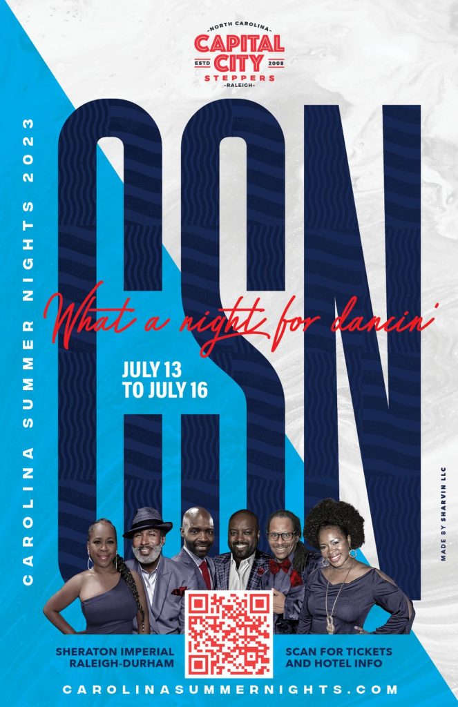
My avenue was through Captial City Steppers. Even as we moved forward and I became a part of the group. When I started, the group had a name but no logo or branding. They had t-shirts with the city skyline that were generic. I knew my background and thought I could add to this group outside of the dance floor. One of the first things I did was a logo and then t-shirts. That Carolina Summer Nights we called it Soul Fest. For the first two of those, I started doing the flyers. I used Capital City Steppers as my sandbox. I tried to get us out there looking polished and professional, and that is where it started.
Are you responsible for the Capital City Steppers Website?
Yes. I am also responsible for the website. Website design, development, video editing, and anything else are all things I do. I do that full-time at the agency I work for in the Creative Department. I could be making digital banners one day, then I could be cutting a 30-second video, color correction, or I could be doing a front-end website landing page, or I could be doing a print ad. There are some other straightforward things I do from 9-5. I use the stepping arena for the more expressive and creative stuff. Even though it is design, it isn’t art. The design has a job to do. Art is a feeling. I try to merge the two.
Regarding Capital City Steppers as your sandbox, how have you grown since you started this work in the stepping community?
For me, the experience is parallel to a dancer’s or stepper’s journey. The more I did it, the more confidence I had in doing it and the better I became overall in executing it. I probably could not count how many events I have done some flyers or work for, but each is this unique opportunity to create something unique. My creation of flyers I look at as the work of a painter. I make a flyer six to seven months up to the event, but once the event is over, that thing is irrelevant and could go in a museum and never be looked at again literally. Then, I am on to the next one. I try to merge design and art influence to have something for both as I execute it.
When did you realize that Steppers loved your work?
A lot of it was local. I started working for NYCE Entertainment in Virginia and Chaundra for VASEF for the Emerald Set. As they took flyers around the country, they started getting questions about who did the flyer. They told people it was me, and I started getting those Facebook inboxes. “Hey, I saw a flyer you did. Can you do some work for us?” Back then, I didn’t put my name on the flyer. I wasn’t even thinking about that part. I was handing it off to promoters saying here is your event flyer, and people can find out who did it. As I kept going forward, I said let me put my name on it so I can have my stamp on things. My work carries a little more weight with my name on it now.
What things do you see happening on flyers for stepping events now that could be better?
I say this with respect. Knowing that anything is subjective, I am just putting my eye on things. Sometimes things look busy regarding the basics of design emphasis, alignment, balance, or having a visual hierarchy to the content. It appears jumbled, and many times that can come from people just using what they have and doing what they can. They find a template and replace the content with whatever information they have for their event.
They use this if it truly fits what they are doing or not. You still need a designer’s eye on it to finesse it and ensure the information isn’t jumbled, does not have too many fonts, or seems too busy. There is a lot more we can do to raise the bar. That’s been my objective since I started doing it to raise the bar and take each one as much as I can to the next level.
What is it about the flyer business that may cost a business its customers?
I can vouch for this on both sides. Timeliness is a big one. When most people need a flyer by next week, the promoter will attend an event. Can you do it by then? It depends on my workload, but you can turn it around. I can still turn around a flyer in a couple of days, but it also depends on the groove I get when I start working on it. I could turn around a flyer in a day if it feels right and flowing for me.
In most cases, cost is the other factor. With every bit of confidence, I know I am not the cheapest person, but I know there is a different value I bring with what I have to give you. There is a balance to it, and I am not trying to hit people over the head with dollar signs, but there is a difference, and it has weight and value. Many people on the set do flyers I have or have not met that do decent work. If you’re good with that, roll with them, but I’m trying to do different things over here to keep raising that bar.
What is so important about a flyer regarding how it represents your business or brand?
It is a reflection of the business or brand. I have a signature when it comes to the style that I use. You can equate this to the style someone has on the dance floor. Tyk has a signature look, Drew, Rick, Charnice – whoever you want to apply that to. If you are framing yourself as a group or a business and marketing your brand, LLC, small business, or stepping group – you should always put your best foot forward. The reality of this dance community is that they have a choice. Invest in your business. It is no different than a car wash company – invest in better soap, better pressure washing, whatever it is.
You must put all these monies into event spaces, contracts, food, beverages, and more. We know how that goes. Don’t forget about the marketing aspect. Don’t invest all these thousands of dollars to pay for a weekend event on the front end even before people get there, but then ask, “Can I get this flyer? I have this $50 budget.” Do you have a $50 budget, or don’t see the value in a flyer? Which is it? Both can be true, but if you want to make a distinction, you want to invest upfront and hit the residuals towards the end, at the event.
I talk with Jonathan McDougal about this all the time. Facebook has spoiled a lot of us when it comes to being able to reach thousands of people in a split second. I could post a flyer made in Microsoft Word, and those thousands of people will see it. They’ll oblige if they like me or are trying to come to my city and stay. They don’t care about what the flyer looks like. Are they going the “cheap route?” Invest.
What is the difference between designing for digital and a printed flyer, and do you think print flyers will ever die?
I don’t think the printed flyer is going anywhere. I think it is here to stay. As long as you have people in a room and a captive audience, you’ll see promoters handing out flyers. That’s just a part of the follow-up. People may have already seen it on Facebook, their timelines, and in whatever groups they are a part of on social media. I don’t think that part is going away.
There are standard sizes that we can do when it comes to print. Most flyers we see are going to be at least 5 x 7. Some people do 4 x 6. That is too small. Whenever I do one, I usually do the half-page size – 5 ½ by 8 ½. If somebody’s coming to put a flyer in your hand or on the table, there’s a sea of flyers, and you want yours to be the biggest, boldest, and baddest. Let it be something people can connect with you. I say print it big. It may cost you 15 cents more per flyer, but that’s worth it.
When it comes to digital, digital gives you some more affordances. Recently, the work I did with. Aki and Red White and Smooth. We do a main flyer, but then we have these feature flyers. They are smaller square ratio flyers featuring the DJs or certain parties or activities at the event. When you get to printing that, that will get costly. We did ten of them. In the digital space, that’s where digital makes sense for promotion.
Each person on the flyer has an asset to share and help promote the event. You have a many-hands approach, and everyone is all on brand, but it’s unique to that person. It incentivizes DJs, instructors, and others at the event to push and promote, just like the promoter is for the whole event. Digital has a place and purpose; you can take advantage of it. But you’ll still need to print flyers and have 250 to 1,000 in stock, so you can hand them out when you go out of town. That’s part of the game.
What has been your favorite flyer to design for steppers events and why?
There are three:
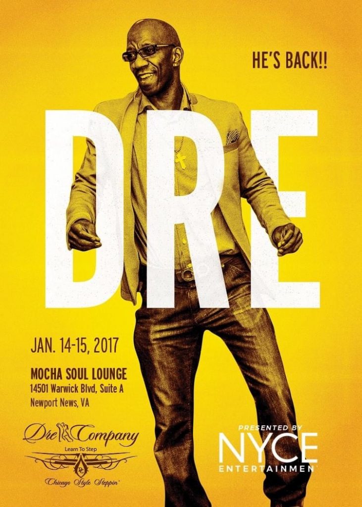
- The first was a purely creative exercise – the first one I did for Dame and Nyce Entertainment when Dre came to Virginia. The nice thing about it was there was less content to put on it. I had more canvas space to play with. Jonathan had taken this picture of Dre in Virginia the year before, and it was just the perfect shot of Dre. Excited energy, smiling, arms up movement, and I just put that on the flyer. It was Dre’s name with him in between the letters. It was the first time I got to play. Oh shoot, Dre is coming to town and getting people hyped.
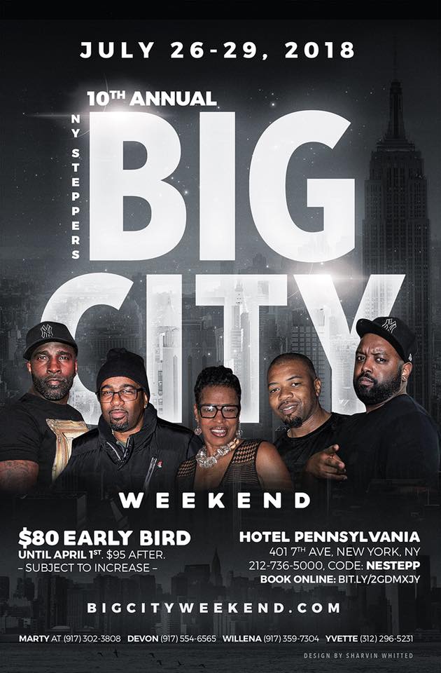
- The second idea was for New York Steppers Big City weekend. I intentionally looked for photos of all the people on the flyers not dressed up. It was an urban theme. I put everybody in a black T-shirt, black clothes. Tyk had a bubble coat. It gave the essence of New York versus a prim, proper Saturday night, stepper sharp feel on the flyer, which you typically get. That was a cool one to do.
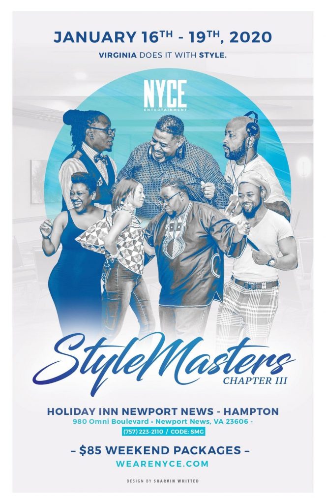
- The third one – probably my favorite- is with StyleMasters for Dame with Nyce Entertainment in VA. I’ve continued this idea for the first one I did for him. I did not want anybody looking at the camera. Everybody was like an actual shot of dancing but not a smiling headshot looking at the camera. It was to be about style. It was about having the right photograph of the right moment. And showcasing style is the whole scheme of Dame’s event – StyleMasters. I did not want anybody looking at the camera, which was an interesting photo search. I did find what I was looking for and could make it happen.
Sharvin Explains the Importance of Good Photography in Stepper Marketing
It makes a difference when you have good photography to work from actual events. With all these people doing events, you need to hire and or have somebody there with a good camera. IPhones and everything take great pictures, but it goes a long way to have a professional photographer at your event documenting your event. When it comes time for the next year, if I’m doing it, I know there are assets of quality that I can go to and a pool of photos I can browse through to find the right moments. On top of the challenge of making the following year’s flyers look different, without good photography, the opportunities are limited. I can work with selfies, but I prefer not to. The hand is cut off. The arm is cut off. Again, limiting.
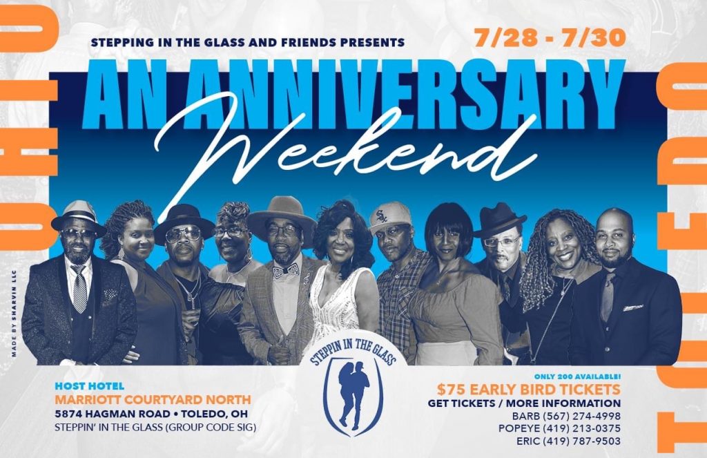
MANY PHOTOS ON A FLYER
Shout out to the Texas Boyz. I’ve been working with them for a good while. I have a lot of people to put on the flyer for Black & Bling. Then, I wanted to have better photos of them, and at this point, I do. Now, I have a library of everybody I’ve used before. Still, I want to make sure I’m not using all of the same photos on different flyers. Sometimes, though, a person’s best picture is the one I can roll with.
GET A GOOD PHOTO COLLECTION
To all the instructors and deejays, please go pay to have somebody do a photo shoot of you. That will genuinely pay off. I promise you. You should have a press kit where someone can go to Google Drive and see 25-30 shots of your best picture. A part of my design process right now is that I will go to your Facebook page and review every photo uploaded of yourself. So, it helps when someone takes care of that part, and I don’t have to do it. Get some professional photography. It pays off.
What inspires you creatively and your design aesthetic in stepper marketing?
There’s a heavy influence from sports design. I’ll go to Pinterest and look at college and university athletic department team photos. The Duke basketball team has 18-20 kids on the roster. That’s more than I typically put on the flyer, but I’m just looking at how they manage all that content and get all those people and faces in there. That’s where I start. I do a good bit of not color correction, but I do a lot of Photoshop work. I’ll take your head off this picture and put it on this body. I do a lot of surgery when it’s necessary. Sometimes I change the clothes to match the event’s color. I find ways to make it look different and interesting and stand out. That is sports design and where it starts for me.
There are so many awesome designers out there. I follow a lot of people, and I’ll see something. I’ll see a color pattern. Sometimes textures inspire me. I’ll see tight treatment when they do something cool and interesting with the words. It’s an experiment for what works and comes together best for the flyer at hand for this content and pictures. And that’s a unique thing every time.
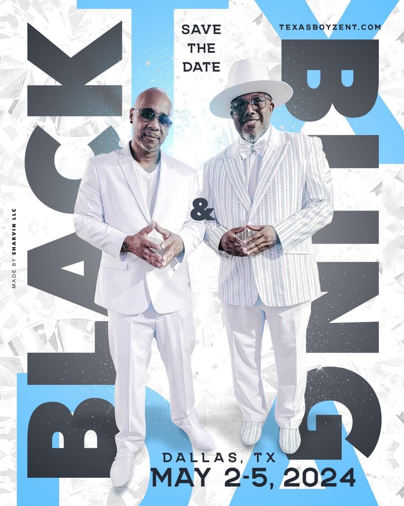
I like to use big words as often as possible because, on the table, you want it to stand out. The larger I can get the words or the person or persons on there, that’s great for me. I use a lot of Pinterest, Instagram and Behance, and other designer inspiration sites. I go to just looking for something interesting, or that makes sense for what I’m doing. Then It goes from there.
A flyer could take two to three hours on the low end. If I’m working on something odd or have a group shot to fit that takes up so much real estate, I have to figure it out. How to fit everything if the flyer needs to be vertical? Do I need to make it landscape? There’s this whole kind of experimental phase where I’m just trying to figure out how to make the content work.
Many people put the itineraries and the full bulleted breakdown on the back. I am good with doing that, but I’m most likely to be more about the highlights. We all know the setup for any three- to four-day weekend event. This is a balance of the content, and content has to be first. Some people want to know everything that’s going on. What’s the theme for Friday night? That needs to be clear and concise; if not, it needs to be pointed to a website, a Facebook landing page, or something with the details.
How did you get started on doing album covers for DJ Black Cool?
I have to go back to how we met. Technically, we met in 2009 in Chicago on the World’s Largest Steppers Contest’s contestant row. He was doing the beginners category that year as well. We might have chopped it up when we just saw each other. Then, as I started to take my trips to Chicago with Tyehimba and Rick, I would see him, and we’d chop it up and form this friendship over the years. Fast forward, whenever he’s doing an event or playing somewhere, we started doing a one-off flyer for him to promote himself. This turned into this feature flyer opportunity, where that idea started.
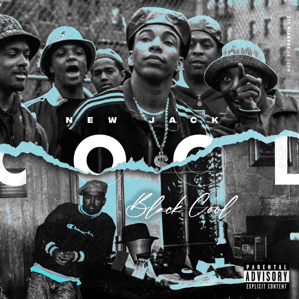
When he got into the groove of making his tracks and doing these custom things, it required a custom and personalized album cover. That’s how it started. I got a folder of images he sent me. It could be a picture of Scarface, a commercial, or something else. We get on the phone, talk about it, and connect on it and the vibe and words we are going for. We go from there, and that’s how we got to these more recent pieces we did for Kicks and Beats and his 50th birthday party.
Good Stepper Marketing Makes An Event Exciting for Steppers and Stands Out
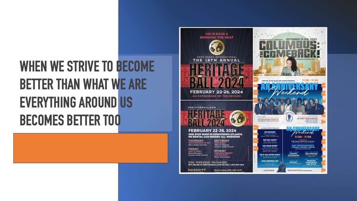
I look at the event branding like movie trailers you see when you go to the movies. You get fifteen minutes of previews of something coming out. That’s how you should feel about the event. It should excite steppers when you “drop something,” like the video we did this year for GDI coming back in 2024. They wanted a short video. The music, clips of the old event, and the Black Panther-inspired theme, Atlanta Forever. I flipped it. It’s a buzz. It’s hype when it comes to your event. You want people thinking about you because there are many people they can think about. It’s a dating pool, and you want to stand out. People have a choice.
We have all these web tools and apps available, like Canva. How do you compete with that potential? What keeps you relevant and valued as a creative designer?
I am about to do some work on Canva. It’s a tool like another paintbrush for you to create. Now the advantage of Canva is it’s in the browser. You can create an account, and it’s free. You can tap into their pre-made templates. That’s perfectly fine, but I can show you the things I made with Canva that others cannot make with Canva unless you have a discerning designer’s eye to stand out. Canva is an awesome tool, just like any other tool. You can learn the tool but still need to know what you do with it.
I don’t have any sense of nervousness regarding this other software. I feel more like a painter. There is still a message you must promote through the design, but I’m trying to create something you can hang on the wall. If you’re trying to develop a theme through Canva, you might struggle a bit, but you can print something from it. You can export something from it that you can use, but It will never be the same as that personal touch with a designer’s eye on it.
Which are you more passionate about, design or Chicago Stepping?
If I had to answer quickly, I would probably be more passionate about stepping. Or, at this point, I would say dancing within stepping. To me, stepping is the pattern we know. We learn how to pedal the bike. How do you get creative with that bike and get some style? I would lean toward dancing more than design. At the same time, I see both as this awesome creative outlet.
Recently I was excited once I got off the plane in Atlanta to be able to dance for the weekend and do what I do. I want to be on the floor. But I also can get hyped once I get into a groove with somebody’s flyer. I can’t wait to show them and see what they think; I can’t wait for them to drop it. There’s still energy in both, even after fifteen years on the dance side. I get just as hyped about dancing as I do about designing. I am going to say it is 60/40 – dance over design. But it might be like 55/45. It’s close. I’m all in on both.
I tell everybody I work with that I aim to raise the bar every time. For StyleMasters, I have done five or six flyers, and even for last year’s flyer, everybody said, “That’s dope!” My challenge is how we can make it even doper, keep this scheme going, and make it different and better than the next. These creative opportunities lightly, I don’t take these lightly.
I can’t do everybody’s flyers because I don’t have the bandwidth between work life, family, and my wife. I can’t do as many as I might want to do it because I don’t have the time to do it all. So, the few that I do. I want to make them the best possible and make them game changers. Sometimes I’m even competing with myself. I remember the Heritage Ball a few years ago. There were six flyers on one table that I designed. I thought, “Crap! I must make all these flyers look different but still looks like my work.” And they must do the job they need to do. It’s a Tough ask, but. I like that challenge.
Sharvin Shares Some Tips and Tricks of the Trade
Here’s one simple trick that I do. It’s not the secret sauce. I did a flyer last year as a vertical flyer, so the next year I’ll probably do it as a horizontal flyer to switch that part up. If it was light last year, I would probably try to go dark next year. Switching it up as a starting point gives me a different space to work in and a different color palette or mood to start from.
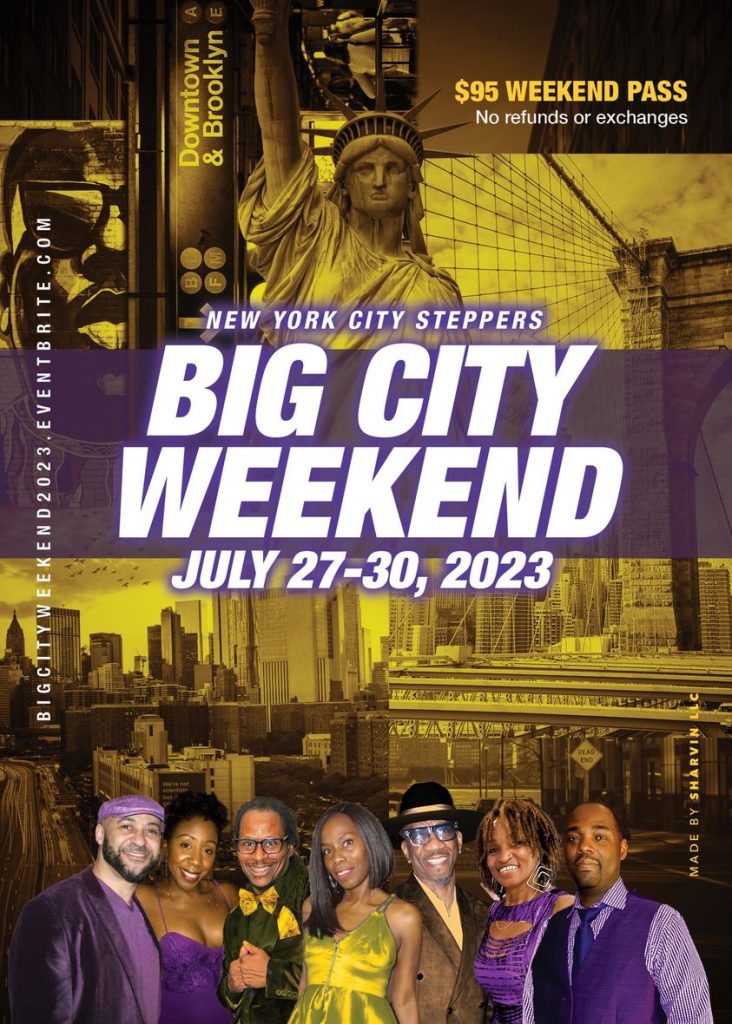
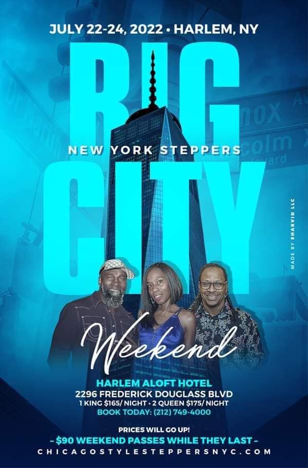
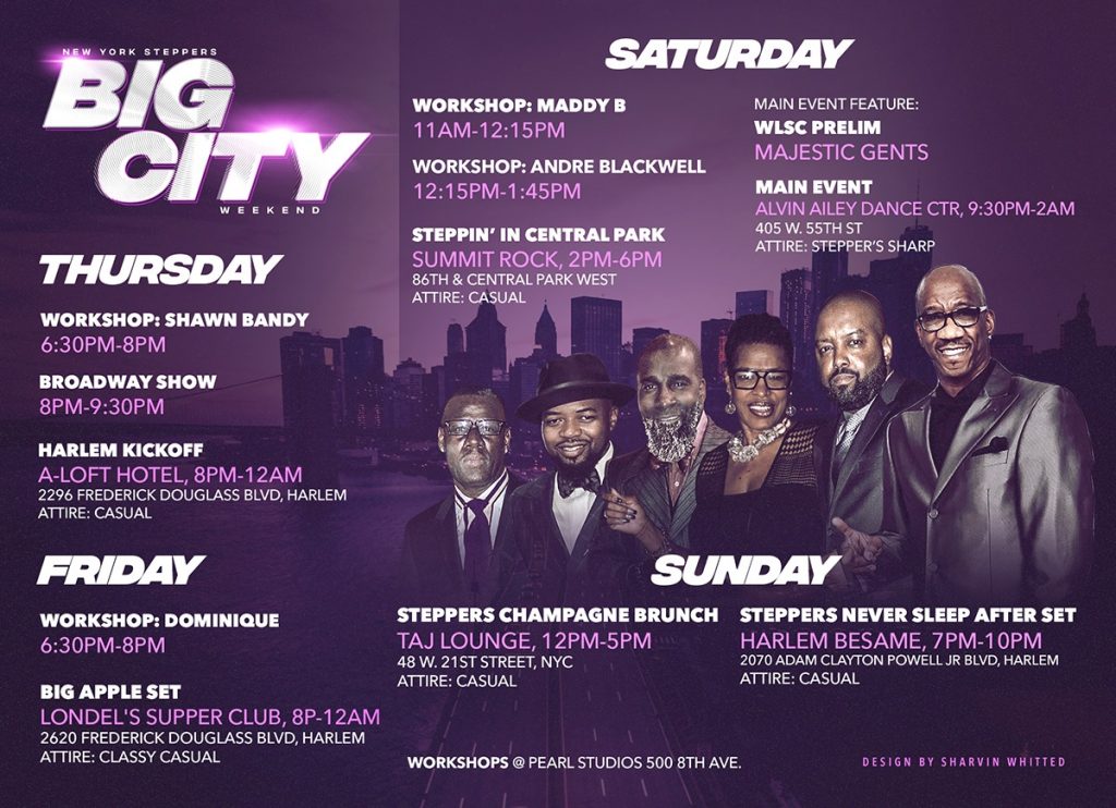

Sometimes the colors are the same every year for an event. It if is blue and gold, that’s the color. I still have to make the whole thing feel different but still feel like the event given by that same group. It’s a fun challenge. You have to know how to bend those forums and make something unique for the group paying for it.
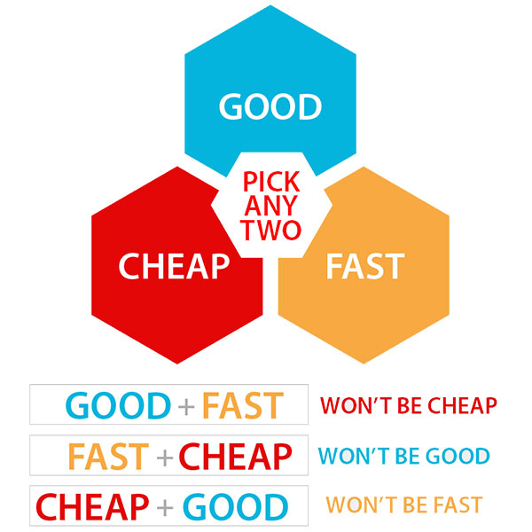
For the community at large and from the overall impression, when it comes to flyers or branding opportunities for these stepper events, you always want to put your best foot forward. And yes, you probably have to pay for that. Remember the good, fast, cheap choices? You can pick two but can’t have all three. That’s just life. Good should be the priority, whichever way you choose.

